Visualizing Top Tweeps with t-SNE, in Javascript
I was recently looking into various ways of embedding unlabeled, high-dimensional data in 2 dimensions for visualization. A wide variety of methods have been proposed for this task. This Review paper from 2009 contains nice references to many of them (PCA, Kernel PCA, Isomap, LLE, Autoencoders, etc.). If you have Matlab available, the Dimensionality Reduction Toolbox has a nice implementation of many of these methods. Scikit Learn also has a brief section on Manifold Learning along with the implementation.
Among these algorithms, t-SNE comes across as one that has a pleasing, intuitive formulation, simple gradient and nice properties. Here is a Google Tech Talks video of Laurens van der Maaten (the author) explaining the method. I set out to re-implement t-SNE from scratch since doing so is the best way of learning something that I know of, and what better language to do this in than - Javascript! :)
Long story short, I’ve implemented t-SNE in JS, released it as tsnejs on Github, and created a small demo that uses the library to visualize the top twitter accounts based on what they talk about. In this post, I thought it might be fun to document a small 1-day project like this, from beginning to end. This also gives me an opportunity to describe some of my projects toolkit, which others might find useful.
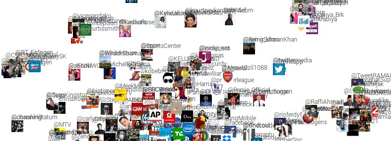
Final demo
First, take a look at the final demo. To create this demo I found the top 500 most followed accounts on Twitter, downloaded 200 of their tweets and then measured differences in what they tweet about. These differences are then fed to t-SNE to produce a 2-dimensional visualization, where nearby people tweet similar things. Fun!
Fetching top tweeps
We first have to identify the top 500 tweeps. I googled “top twitter accounts” and found http://twitaholic.com/ , which lists them out. However, the accounts are embedded in the webpage and we need to extract them in structured format. For this, I love a recent YC startup Kimono; I use it extensively to scrape structured data from websites. It lets you click the elements of interest (the Twitter handles in this case), and extracts them out in JSON. Easy as pie!
Collecting tweets
Now we have a list of top 500 tweeps and we’d like to obtain their tweets to get an idea about what they tweet about. My library of choice for this task is Tweepy. Their documentation is quite terrible but if you browse the source code things seem relatively simple. Here’s an example call to get 200 tweets for a given user:
tweets = tweepy.Cursor(api.user_timeline, screen_name=user).items(200)
We iterate this over all users, extract the tweet text, and dumpt it all into files, one per account. I had to be careful with two annoyances in process:
- Twitter puts severe rate limits on API calls, so this actually took several hours to collect, wrapped up in try catch blocks and
time.sleepcalls. - The returned text is in Unicode, which leads to trouble if you’re going to try to write it to file.
One solution for the second annoyance is to use the codecs library:
import codecs
codecs.open(filename, 'w', 'utf-8').write(tweet_texts)
Oh, and lets also grab and save the Twitter profile pictures, which we’ll use in the visualization. An example for one user might be:
import urllib # yes I know this is deprecated
userobj = api.get_user(screen_name = user)
urllib.urlretrieve(imgname, userobj.profile_image_url) # save image to disk
I should mention that I write a lot of quick and dirty Python code in IPython Notebooks, which I very warmly recommend. If you’re writing all your Python in text editors, you’re seriously missing out.
Quantifying Tweep differences
We now have 500 tweeps and their 200 most recent tweets concatenated in 500 files. We’d now like to find who tweets about similar things. Scikit learn is very nice for quick NLP tasks like this. In particular, we load up all the files and create a 500-long array where every element are the 200 concatenated tweets. Then we use the TfidfVectorizer class to extract all words and bigrams from the text data, and to turn every user’s language into one tfidf vector. This vector is a fingerprint of the language that each person uses. Here’s how we can simply wire this up:
from sklearn.feature_extraction.text import CountVectorizer,TfidfVectorizer
vectorizer = TfidfVectorizer(min_df=2, stop_words = 'english',\
strip_accents = 'unicode', lowercase=True, ngram_range=(1,2),\
norm='l2', smooth_idf=True, sublinear_tf=False, use_idf=True)
X = vectorizer.fit_transform(user_language_array)
D = -(X * X.T).todense() # Distance matrix: dot product between tfidf vectors
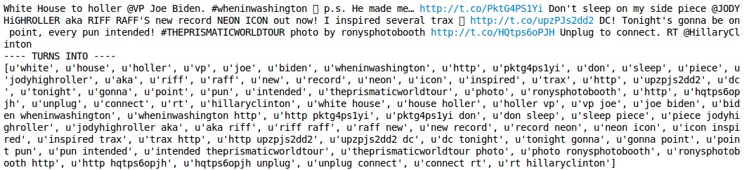
In the above, user_language_array is the 500-element array that has the concatenated tweets. The TfidfVectorizer class looks through all tweets and takes note of all words (unigrams) and word bigrams (i.e. series of two words). It builds a dictionary out of all unigram/bigrams and essentially counts up how often every person uses each one. Here’s an example of some tweet text converted to unigram/bigrams:
The tfidf vectors are returned stacked up as rows inside X, which has size 500 x 87,342. Every one of the 87,342 dimensions corresponds to some unigram or bigram. For example, the 10,000th dimension could correspond to the frequency of usage of the unigram “YOLO”. The vectors are L2 normalized, so the dot product between these vectors is related to the angle between any two vectors. This can be interpreted as the similarity of language. Finally, we dump the matrix and the usernames into a JSON file, and we’re ready to load things up in Javascript!
The Visualization parts
We now create an .html file and import jQuery (as always), and d3js, which I like to use for any kind of plotting. We load up the JSON that stores our distances and usernames with jQuery, and use d3js to initialize the SVG element that will hold all the users. For starters, we plot the users at random position but we will soon arrange them so that similar users cluster nearby with t-SNE. Inspect the code on the demo page to see the jQuery and d3js parts (Ctrl+U). In the code, we see a few things I like to use:
- I like to use Google Fonts to get prettier-than-default fonts. Here, for example I’m importing Roboto, and then using it in the CSS.
- Next, we see an import of syntaxhighlighter code which dynamically highlights code on your page.
- Then we see Google tracking JS code, which lets me track statistics for the website on Google Analytics.
- I didn’t use Bootstrap on this website because it’s very small and simple, but normally I would because this makes your website right away work nicely on mobile.
t-SNE
Finally we get to the meat! We need to arrange the users in our d3js plot so that similar users appear nearby. The t-SNE cost function was described in this 2008 paper by van der Maaten and Hinton. Similar to many other methods, we set up two distance metrics in the original and the embedded space and minimize their difference. In t-SNE in particular, the original space distance is based on a Gaussian distribution and the embedded space is based on the heavy-tailed Student-t distribution. The KL-divergence formulation has the nice property that it is asymmetric in how it penalizes distances between the two spaces:
- If two points are close in the original space, there is a strong attractive force between the the points in the embedding
- Conversely, if the two points are far apart in the original space, the algorithm is relatively free to place these points around.
Thus, the algorithm preferentially cares about preserving the local structure of the high-dimensional data. Conveniently, the authors link to multiple implementations of t-SNE on their website, which allows us to see some code for reference as well (if you’re like me, reading code can be much easier than reading text descriptions). We’re ready to write up the Javascript version!
The final code can be seen in tsne.js file, on Github. Note how we’re wrapping all the JS code into a function closure so that we don’t pollute the global namespace. This is a very common trick in Javascript that is essentially used to implement classes. Note also the large number of utility boring code I had to include up top because Javascript is not exactly intended for math :) The core function where all magic happens is costGrad(), which computes the cost function and the gradient of the objective. The correct implementation of this function is double checked with debugGrad() gradient check. Once the analytic gradient checks out compared to numeric gradient, we’re good to go! We set up a piece of Javascript to call our step() function repeatedly (setInterval() call), and we plot the solution as it gets computed.
Phew! Final result, again: t-SNE demo.
I hope some of the references were useful. If you use tsnejs to embed some of your data, let me know!
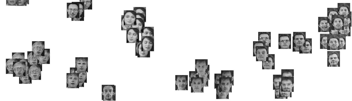
Bonus: Word Embedding t-SNE Visualization
I created another demo, this time to visualize word vector embeddings. Head over here to see it. The word embeddings are trained as described in this ACL 2012 paper.
The (unsupervised) objective function makes it so that words that are interchangable (i.e. occur in very similar surrounding context) are close in the embedding. This comes across in the visualization!